FinDash
Adaptive Flutter Financial Dashboard UI Showcase across Desktop, Tablet & Mobile
Overview
FinDash is a Flutter-based responsive financial dashboard demo and adaptive UI showcase focused on solving a core multi-device design challenge: how to present dense financial information—expense summaries, card carousels, transaction histories, quick invoice forms, and income charts—across desktop monitors, tablets, and mobile phones without relying on naive uniform scaling.
Rather than stretching a single layout across screen sizes, FinDash orchestrates three dedicated layout compositions (DashboardDesktopLayout, DashboardTabletLayout, and DashboardMobileLayout) through a reusable AdaptiveLayout widget powered by LayoutBuilder and AnimatedSwitcher, complemented by SizeConfig viewport thresholds and clamped responsive typography (getResponsiveFontSize).
Beyond layout adaptation, FinDash implements functional dashboard workflows powered by flutter_bloc (DashboardCubit and ThemeCubit) over a separated data/domain/presentation structure using DashboardRepository and DashboardMockDatasource. Users can switch reporting periods (Weekly, Monthly, Yearly), search transactions by title, filter by Income or Expense, export the currently filtered dataset to CSV or multi-page A4 PDF reports, interact with fl_chart pie segments, and persist Light/Dark mode preferences via SharedPreferences—establishing a clean UI foundation with planned future evolution toward live backend integration, authentication, and localization.
FinDash
Adaptive Flutter Financial Dashboard UI Showcase across Desktop, Tablet & Mobile
Adaptive Responsive Dashboard
Three dedicated viewport layouts (DashboardDesktopLayout ≥ 1300px, DashboardTabletLayout 800px–1299px, and DashboardMobileLayout < 800px) orchestrated at runtime via AdaptiveLayout, LayoutBuilder, and a 400ms AnimatedSwitcher — paired with SizeConfig.tablet (900px) navigation adaptation and clamped responsive typography.
Technical Architecture
A high-level overview of how the system is structured to ensure scalability and maintainability.
Adaptive Layout & Viewport Orchestration (core/widgets & presentation/layouts)
Runtime layout switching and viewport-aware navigation composition across Desktop, Tablet, and Mobile breakpoints.
Separated Data, Domain & Mock Repository Layer (features/dashboard/data & domain)
Feature-oriented separation decoupling presentation Cubits from the underlying mock data source via an abstract repository contract.
Cubit State Management & Persisted Theme Preferences (presentation/cubits)
Unidirectional state management handling asynchronous period loading, combinable search/type filtering, and persistent theme mode.
Reusable Core Widgets, Adaptive Charting & Export Service (core/utils & widgets)
Modular dashboard sections, viewport-aware fl_chart visualization, clamped typography, and CSV/PDF document generation.
Engineering Insights
Key technical decisions and challenges encountered during the development process.
Key Decisions
Dedicated Breakpoint Layout Trees Instead of Uniform Scaling
A three-column desktop financial dashboard becomes unreadable on mobile phones if scaled down proportionally, while a mobile single-column stack wastes horizontal screen real estate on desktop monitors.
Implemented AdaptiveLayout using LayoutBuilder to mount distinct widget trees at < 800px (DashboardMobileLayout), < 1300px (DashboardTabletLayout), and ≥ 1300px (DashboardDesktopLayout), while DashboardTabletLayout composes CustomDrawer alongside DashboardMobileLayout to share the single-column content stack without code duplication.
Secondary Desktop Breakpoint (1300px – 1749px) for Income Chart Readability
At the entry desktop breakpoint (1300px), the right column holds only 1/3 of the content area alongside the sidebar and left column, causing a side-by-side donut chart and text legend row to crowd text labels.
Added a secondary width check in IncomeSectionBody (width >= SizeConfig.desktop && width < 1750) that swaps the side-by-side Row (IncomeChart + IncomeDetails) for DetailedIncomeChart, rendering percentages and category titles directly on the interactive PieChart sections until wider monitor space (≥ 1750px) is available.
Clamped Multi-Tier Scale Factors for Responsive Typography
Fixed pixel font sizes either overflow compact cards on small screens or appear undersized on wide desktop displays, whereas unconstrained linear scaling produces extreme text sizes.
Built getResponsiveFontSize() and getScaleFactor() in core/utils/responsive_font_size.dart using tier-specific reference widths (width / 900 below 900px, (width / 1000).clamp(0.9, 1.1) below 1300px, and width / 1920 on desktop) and clamped every computed font size between 80% and 120% of its base Montserrat style.
Repository Abstraction Over Mock Data to Support Interactive Workflows
Even in a UI-focused dashboard showcase, hardcoding static lists directly inside widgets prevents realistic testing of loading skeletons, period transitions, search filtering, and report exports.
Introduced DashboardRepository and DashboardMockDatasource beneath DashboardCubit. Switching between Weekly, Monthly, and Yearly periods triggers DashboardShimmerLoader and reloads period-scoped mock datasets, while search, filter chips, and CSV/PDF exports operate reactively on DashboardData.filteredTransactions.
Technical Challenges
Coordinating Scrollable Dashboard Columns Without Unbounded Height Exceptions
Combining a multi-section two-column desktop layout and a stacked mobile layout inside CustomScrollView while using Expanded children for aligned bottom sections can trigger Flutter RenderBox unbounded height errors.
Wrapped layout columns inside CustomScrollView with SliverFillRemaining(hasScrollBody: false), allowing sections like IncomeSection to expand naturally to fill remaining viewport height on large screens while scrolling safely when content exceeds vertical bounds.
Adaptive-Height Card Carousel Synchronization with Animated Indicators
Standard Flutter PageView requires a fixed height or aspect constraint, which complicates responsive card sizing across mobile, tablet, and desktop column widths.
Used ExpandablePageView in MyCardsPageView paired with an AspectRatio(420 / 215) MyCard container and a PageController listener in MyCardsSection that drives the 300ms AnimatedContainer width transition in CustomDotIndicator.
Preserving Active Search and Filter Context Across CSV & PDF Exports
Exporting raw unfiltered transactions when a user has narrowed the list by search query, transaction type (Income/Expense), and time period produces inconsistent reports.
Centralized _applyFilters() inside DashboardCubit so every search or chip selection updates state.data.filteredTransactions, and wired ExportButton to pass both filteredTransactions and selectedPeriod directly into ExportService.exportToCsv() and ExportService.exportToPdf().
Adaptive Responsive Layout System
One unified financial dashboard adapting across Desktop (≥ 1300px), Tablet (800px – 1299px), and Mobile (< 800px) breakpoints.
Desktop Layout (≥ 1300px) — Full two-column layout with persistent sidebar
DashboardDesktopLayout composes an outer Row with an Expanded (flex: 1) CustomDrawer sidebar, a 32px gap, and an Expanded (flex: 3) CustomScrollView + SliverFillRemaining workspace whose inner Row splits AllExpensesAndQuickInvoiceSection (Expanded flex: 2) and the right-hand MyCardsAndTransactionHistory + Expanded IncomeSection column (Expanded flex: 1) separated by a 24px gap.
Tablet Layout (800px – 1299px) — Sidebar + single-column scrollable content
DashboardTabletLayout composes a Row with an Expanded (flex: 1) CustomDrawer sidebar, a 32px gap, an Expanded (flex: 3) Padding(top: 25) wrapping DashboardMobileLayout (single-column CustomScrollView), and a trailing 32px horizontal spacer.
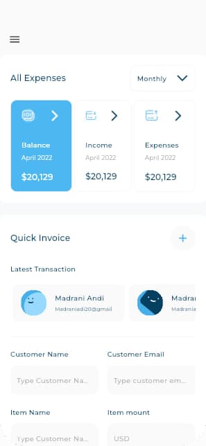
Mobile Layout (< 800px) — Stacked vertical layout with hamburger drawer
DashboardMobileLayout stacks AllExpensesAndQuickInvoiceSection, MyCardsAndTransactionHistory, and IncomeSection vertically with 24px spacing inside CustomScrollView + SliverFillRemaining, while DashBoardView (< 900px via SizeConfig.tablet) attaches a top AppBar with theme toggle and a 70%-width slide-out CustomDrawer.
Ready to dive deeper?
Explore the source code or see how this architecture translates to other projects in my portfolio.